All calculations below use death statistics. These calculations use data from government sources. Some analyses are being done using numbers from all-cause deaths, which have increased significantly. One of these analyses is shown in Statistics and Calculation #5. Under Statistics and Calculation #4, I also show a chart of relative risks compared to other causes of death.
Were we to do the same with statistics for those suffering from life-changing adverse events, there would be much greater cause for concern. Unfortunately, those statistics are not as readily available.
Statistics and Calculation #1
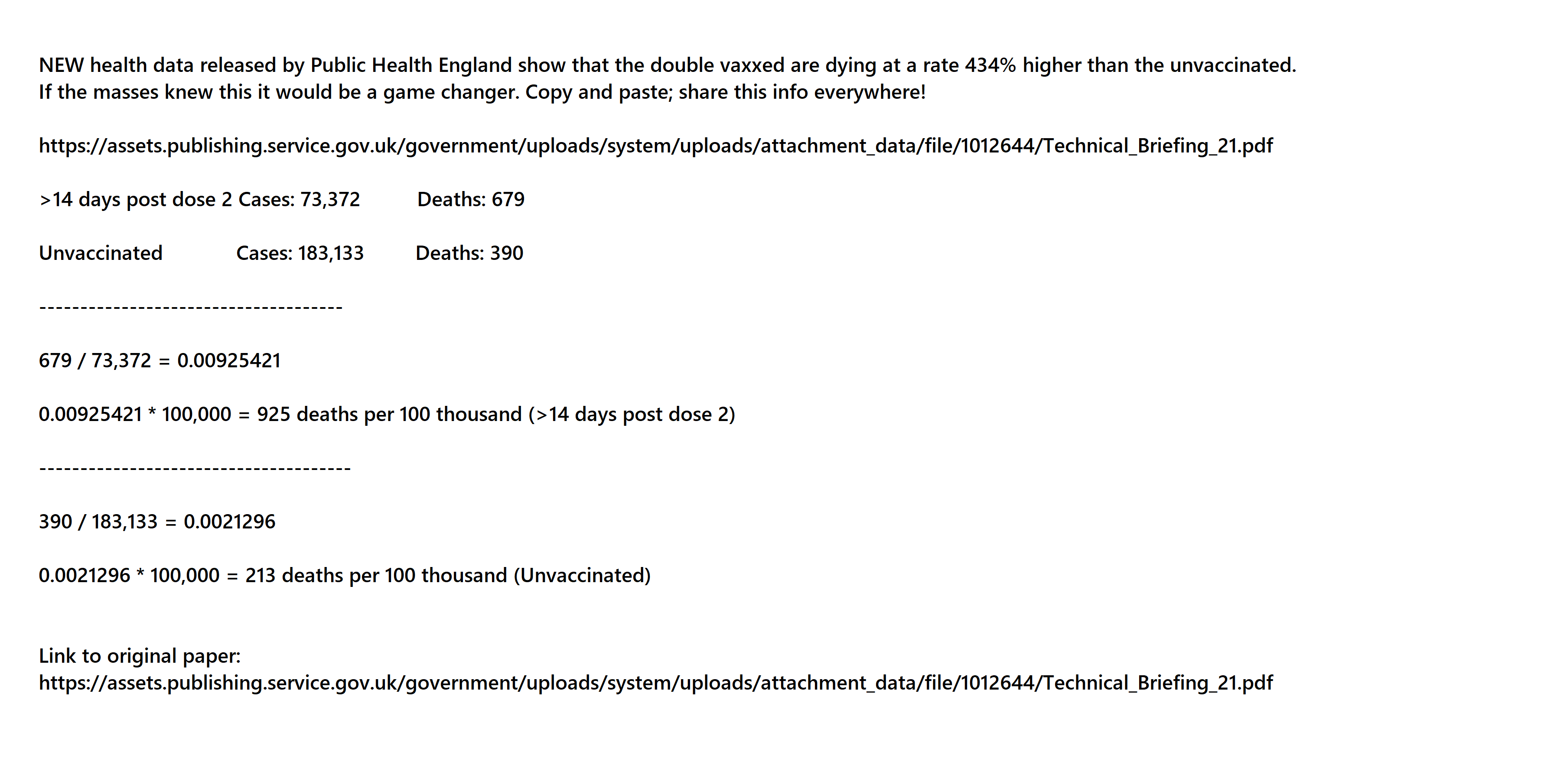
Calculations someone did based on Technical Briefing 21
The case numbers come from page 22 of Technical Briefing 21, “Delta cases” block, “All cases” line, last two columns. The death numbers come from page 23 of Technical Briefing 21, last line of chart, last two columns.
| Vaccine status | Cases | Deaths | Ratio | Deaths per 100,000 |
| >14 days post dose 2 | 73,372 | 679 | 679 ÷ 73,372 = 0.00925421 | 925 |
| Unvaccinated | 183,133 | 390 | 390 ÷ 183,133 = 0.00212959 | 213 |
925 ÷ 213 = 4.34
These numbers show that vaccinated COVID-19 patients are more than 4 times more likely to die than unvaccinated COVID-19 patients.
It appears that England is using the same 14-day qualifier for COVID-19 death classifications. If so, then some of the deaths in the unvaccinated row had just gotten the jab.
Source for Statistics and Calculation #1:
- August 20, 2021. “SARS-CoV-2 Variants of Concern and Variants under Investigation in England: Technical Briefing 21.” Public Health England, August, 36.


https://assets.publishing.service.gov.uk/government/uploads/system/uploads/attachment_data/file/1012644/Technical_Briefing_21.pdf.
Government, PDF.
Data shows double-jabbed have 434% higher death rate than unvaccinated.
Statistics and Calculation #2
The video linked below explains how the calculations are done. The numbers come from the last two columns of the chart on page 14 in the Week 36 report.
| Age Group | Cases among vaccinated per 100,000 |
Cases among unvaccinated per 100,000 |
Cases among vaccinated per 100,000 |
Cases among unvaccinated per 100,000 |
| Under 18 | 476 | 1,192.9 | 1,969.3 33.80% |
3,857.6 66.20% |
| 18 – 29 | 711.1 | 1,520.8 | ||
| 30 – 39 | 782.2 | 1,143.9 | ||
| 40 – 49 | 1,116.2 | 880.4 | 3,622.1 55.60% |
2,892.5 44.40% |
| 50 – 59 | 962 | 729.7 | ||
| 60 – 69 | 672.3 | 487.5 | ||
| 70 – 79 | 480.5 | 367.5 | ||
| 80 and over | 391.1 | 427.4 | ||
| 5,591.4 45.31% |
6,750.1 54.69% |
It would appear that people older than 40 are less likely to get sick if they have not been vaccinated.
It appears that England is using the same 14-day qualifier for COVID-19 death classifications. If so, then some of the deaths in the unvaccinated columns had just gotten the jab.
Sources for Statistics and Calculation #2:
- September 9, 2021. “COVID-19 Vaccine Surveillance Report – Week 36.” PHE gateway number: GOV-9692. Public Health England.
https://assets.publishing.service.gov.uk/government/uploads/system/uploads/attachment_data/file/1016465/Vaccine_surveillance_report_-_week_36.pdf.
Government, PDF. - September 12, 2021. Robert Peston: “The Overwhelming Majority of Cases Are in the Vaccinated.” Politico.

https://www.bitchute.com/video/3mnd3p33Xb0K/.
Video.
This video uses the data in the above report to show that COVID-19 rates are higher in those 40 and over. Check out this videographer’s channel for other analyses of statistics. There are several.
Statistics and Calculation #3
The following is based on Infection Fatality Rate Scenario #5 in the CDC’s COVID-19 Pandemic Planning Scenarios. These are PROJECTIONS, not actual numbers. Actuals are shown in Statistics #4.
| Age Group | Deaths in 1,000,000 |
Survival Rate |
Death Ratio |
| 0 – 17 years | 20 | 99.998% | 1 in 50,000 |
| Teens at NSW stadium jab event, on the spot1 | 125 | 99.988% | 1 in 8,000 |
| 18 – 49 years | 500 | 99.950% | 1 in 2,000 |
| Teens at NSW stadium jab event, estimate over time2 | 625 | 99.938% | 1 in 1,600 |
| 50 – 64 years | 6,000 | 99.400% | 1 in 167 |
| 65 years and older | 90,000 | 91.000% | 1 in 11 |
- Numbers extrapolated to the rate per 1,000,000 so that they can be properly compared with other numbers in this chart. And these teens could still become infected with COVID-19 later.
- Numbers extrapolated to the rate per 1,000,000. This is a conservative estimate based on 5 times the number who died at the event. The multiplier was obtained by eye-balling a “death curve” from an analysis of VAERS numbers. The multiplier could be accomplished in less than a week, according to the numbers on the “death curve.”
Sources for Statistics and Calculation #3:
- March 19, 2021. “COVID-19 Pandemic Planning Scenarios.” Centers for Disease Control and Prevention.

https://www.cdc.gov/coronavirus/2019-ncov/hcp/planning-scenarios.html.
Centers for Disease Control and Prevention. - May 15, 2021. SMOKING GUN? 193K VAERS Reports, 3.9K Death Records; 32 People Compare It To Getting Hit By A Bus. Tim Truth. Runtime: 17:02.
https://www.bitchute.com/video/Ei48VrtvCZ8n/.
Video.
Statistics #4
Generally, elderly people who live in the general community have a high survival rate. Oddly, the IFR in UK was much higher than anywhere else, both for the community-dwelling and institutionalized. UK has one of the highest jab rates in the world with the rate among institutionalized elderly virtually 100%.
We could extract data and calculate IFR on another 84 age-strata observations from 19/23 seroprevalence surveys (three had no mortality data for any eligible non-elderly age stratum (25, 30, 35) and one sampled no individuals <65 years of age (44)). The 19 surveys came from 11 countries. For the age group 0-19 years, only five studies had sampled participants for seroprevalence in the corresponding age group (24, 29, 31, 38, 41); for the other studies, the closest available age group was used. Across all countries (Figure 3), the median IFR was 0.0027%, 0.014%, 0.031%, 0.082%, 0.27%, and 0.59%, at 0-19, 20-29, 30-39, 40-49, 50-59, and 60-69 years, using data from 9, 9, 10, 9, 11, and 6 countries, respectively.
Just for fun and comparison, I’m going to mix some general death statistics into this next chart. We will all die of something. How do our odds of dying of COVID-19 stack up to other causes of death? When we look at the numbers this way, it doesn’t look so grim. The added statistics will be marked with this background .
| Age Group | Deaths in 1,000,000 | Survival Rate | Death Ratio |
| Struck by lightening | 12 | 99.9988% | 1 in 84,079 |
| Dog attack | 12 | 99.9988% | 1 in 86,781 |
| COVID-19, 0 – 19 years | 27 | 99.9973% | 1 in 37,037 |
| Sharp objects | 34 | 99.9966% | 1 in 29,334 |
| Sunstroke | 121 | 99.9879% | 1 in 8,248 |
| Teens at NSW stadium jab event, on the spot1 | 125 | 99.9875% | 1 in 8,000 |
| COVID-19, 20 – 29 years | 140 | 99.9860% | 1 in 7,143 |
| Airplane crash | 142 | 99.9858% | 1 in 7,032 |
| COVID-19, 30 – 39 years | 310 | 99.9690% | 1 in 3,226 |
| Teens at NSW stadium jab event, estimate over time2 | 625 | 99.9375% | 1 in 1,600 |
| Fire or smoke | 646 | 99.9354% | 1 in 1,547 |
| COVID-19, 40 – 49 years | 820 | 99.9180% | 1 in 1,220 |
| Drowning | 887 | 99.9113% | 1 in 1,128 |
| Motorcyclist | 1,112 | 99.8888% | 1 in 899 |
| Pedestrian incident | 1,842 | 99.8158% | 1 in 543 |
| COVID-19, 50 – 59 years | 2,700 | 99.7300% | 1 in 370 |
| Gun assault | 3,460 | 99.6540% | 1 in 289 |
| COVID-19, 60 – 69 years | 5,900 | 99.4100% | 1 in 169 |
| Motor vehicle crash | 9,346 | 99.0654% | 1 in 107 |
| Falls | 9,434 | 99.0566% | 1 in 106 |
| Opioid drug overdose | 10,870 | 98.9130% | 1 in 92 |
| Suicide | 11,364 | 98.8636% | 1 in 88 |
| COVID-19, Community-dwelling elderly, all locations | 24,000 | 97.6000% | 1 in 42 |
| COVID-19, All elderly, all locations | 55,000 | 94.5000% | 1 in 18 |
| COVID-19, Community-dwelling elderly, Public Health England | 85,900 | 91.4100% | 1 in 12 |
| COVID-19, All elderly, Public Health England | 140,300 | 85.9700% | 1 in 7 |
| Cancer | 142,857 | 85.7143% | 1 in 7 |
| Heart disease | 166,667 | 83,333% | 1 in 6 |
- Numbers extrapolated to the rate per 1,000,000. And they could still become infected with COVID-19 later.
- Numbers extrapolated to the rate per 1,000,000. This is a conservative estimate based on 5 times the number who died at the event. The multiplier was obtained by eye-balling a “death curve” from an analysis of VAERS numbers. The multiplier could be accomplished in less than a week, according to the numbers on the “death curve.” The actual number of deaths resulting from this event are likely to be higher.
Sources for Statistics #4:
- July 13, 2021. Cathrine Axfors, and John P. A. Ioannidis. “Infection Fatality Rate of COVID-19 in Community-Dwelling Populations with Emphasis on the Elderly: An Overview.”

https://doi.org/10.1101/2021.07.08.21260210.
Research Journal.
To see the data table, click on the “Full Text” tab and scroll down past the first paragraph in the “Methods” section. In the “Table 1” block, Click on either “View inline” or “View popup”, according to how you wish to view the table. All images that you will see are part of the same table. Apparently, it takes more than one page to print. - “Injury Facts – Odds of Dying – Data Details.” National Safety Council. Accessed September 13, 2021. https://injuryfacts.nsc.org/all-injuries/preventable-death-overview/odds-of-dying/data-details/.

Reference. - February 2, 2012. Discovery Fit and Health Writers. “Odds of Death: A Numbers Game.” HowStuffWorks. February 2, 2012. https://health.howstuffworks.com/diseases-conditions/death-dying/what-are-the-odds.htm.
Reference. - May 15, 2021. SMOKING GUN? 193K VAERS Reports, 3.9K Death Records; 32 People Compare It To Getting Hit By A Bus. Tim Truth. Runtime: 17:02.
https://www.bitchute.com/video/Ei48VrtvCZ8n/.
Video.
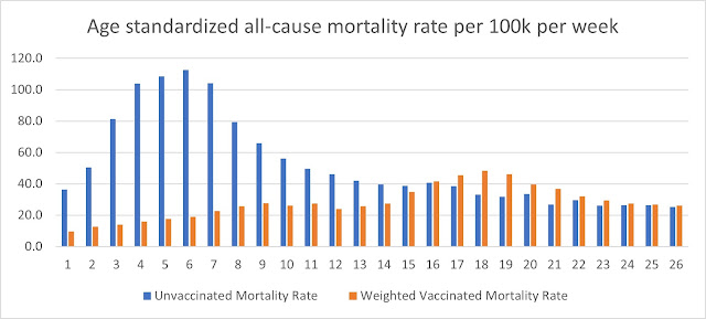
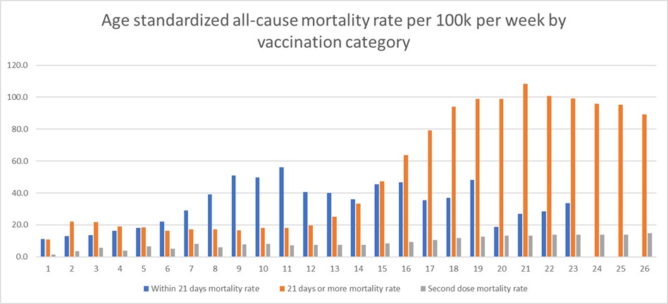
Statistics #5
Here is a novel idea. Don’t be so concerned for whether the injections actually killed the people. Just look at all-cause mortality and whether the person had ever taken a COVID-19 vaccine. Fortunately, England has the data needed for this one. Please see the article for details of how the authors came up with these graphs. They state:
It turns out that, even using this age adjusted mortality rate, the death rate is currently higher among the vaccinated than the unvaccinated.
Sources for Statistics #5:
- September 27, 2021. Norman Fenton and Martin Neil. “A Comparison of Age Adjusted All-Cause Mortality Rates in England between Vaccinated and Unvaccinated.” Rights and Freedoms.

https://rightsfreedoms.wordpress.com/2021/09/27/a-comparison-of-age-adjusted-all-cause-mortality-rates-in-england-between-vaccinated-and-unvaccinated/.
Blog.
It appears that England is using the same 14-day qualifier for COVID-19 death classifications. If so, there actually could be far more deaths among the vaccinated than at first it appears.
Extra source:
- October 10, 2021. Simple Statistical Analysis Showing the INSANITY of Taking the CV19 “Vaccine.” Jim Fetzer. Runtime: 2:56.
https://www.bitchute.com/video/BlxdEzTTWDaI/.
Video.
“Once you’ve applied a moment of critical thinking, you’ll find that anyone advocating these requests (‘mandates’) is either uninformed, irrational or has an ulterior motive for suggesting that everyone should be vaccinated.”
See also, on this site:
- Vaccinated people who die within 14 days of being jabbed are counted as unvaccinated
- 24,000 teenagers herded into stadium for jabs, 3 dead
The following is the “death curve” from an analysis of VAERS numbers. I used this to estimate how many actually died over time as a result of the NSW stadium jab event.
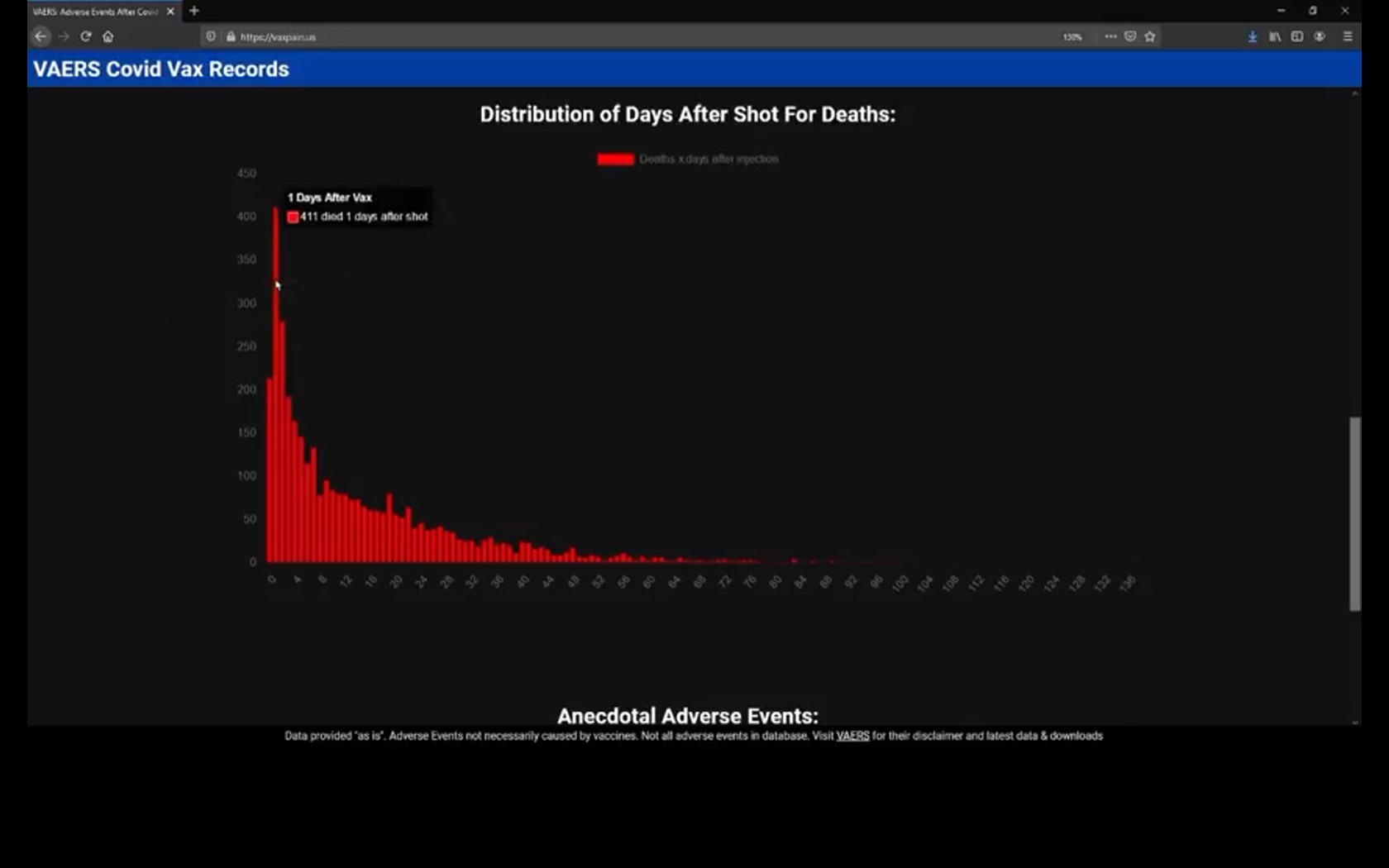
Screen print from Tim Truth: Deaths by Day Since Vaccination
It is probably at least as important to check statistics for life-changing adverse events as well, since they affect quality of life, but those are not as readily available.
It is difficult to know how these numbers might have been different had early treatment been part of the standard protocols. Early treatment protocols do exist, but they are generally shunned by mainstream doctors. Given the success reported by those who use early treatment protocols, failure to provide care according to these early treatment protocols is medical negligence at best and possibly criminal.
It is also difficult to know how many of the “unvaccinated” in these statistics are actually freshly vaccinated people who suffered an adverse event. In a statistical sleight of hand, those who received their first dose within 14 days of death are reported as “unvaccinated.”